
A/B Testing and P-Values: The Subtleties of Replication
Article summary
Many analysts assume that if an experiment or analysis results in a statistically significant p-value then repeating the same experiment will likely again result in a statistically significant p-value. However, this is not always true, even with large sample sizes. In fact, experiment replications often lead to substantially different p-values. This is because the p-value is sensitive to the sample size and underlying effect size, as well as natural random variation that arises in experimentation and analysis. This is one reason there is debate over the proper usage of p-values.
This article focuses on expected p-value variation in A/B website testing, a common use of p-values in a business context. However, many of the lessons apply to other uses of p-values such as forecasting or cohort analysis.
Contact information
We’d love to hear from you! Please direct all inquires to info@theresear.ch
Quick guide
Supplementary Material
For technical details including code samples, please click here.
Article Status
This article is currently under review (articles are under review until they are approved by three expert reviewers).
Paid Reviewers
The reviewers below were paid by The Research to ensure this article is accurate and fair. That work includes a review of the article content as well as the code that produced the results. This does not mean the reviewer would have written the article in the same way, that the reviewer is officially endorsing the article, or that the article is perfect, nothing is. It simply means the reviewer has done their best to take what The Research produced, improve it where needed, given editorial guidance, and generally considers the content to be correct. Thanks to all the reviewers for their time, energy, and guidance in helping to improve this article.
Dan Hippe, M.S., Statistics, University of Washington (2011). Dan is currently a statistician in the Clinical Biostatistics Group at the Fred Hutchinson Cancer Research Center in Seattle, Washington. He is a named co-authored on more than 180 journal articles, is on the editorial board of Ultrasound Quarterly, and is a statistical consultant and reviewer for the Journal of the American College of Radiology.
Other reviewers will be added as funding allows.
“Replication is fundamental to science, so statistical analysis should give information about replication. Because p-values dominate statistical analysis...it is important to ask what p says about replication. The answer to this question is ‘Surprisingly little.’”
A necessary introduction to significance testing
While p-values may not be sexy, they are at the heart of many analyses across a wide range of disciplines. For instance, in business analytics p-values are used in a variety of settings including A/B website testing, to judge the importance of coefficients in forecast regressions, and in big data cohort analysis (to name just a few use cases). This article will focus on one of these use cases: A/B website testing.
P-values themselves are part of the so-called “null hypothesis significance testing” (NHST) paradigm. Though the process of the NHST may seem familiar, the details are often not well understood; there are many critiques of the process by statisticians and common misinterpretations even by experienced analysts.
NHST begins with a null hypothesis, often taken to be what is sometimes called the “nil hypothesis,” that the average difference between two or more groups is zero for some metric of interest. (One common criticism of NHST among statisticians is that a null hypothesis of no difference is almost always false in real-world settings and therefore attempting to reject a false premise is a fruitless exercise [1]. This criticism actually extends to any point null, going by the name Zero Probability Paradox [2]. However, let us put these criticisms to the side for now).
The null hypothesis doesn’t necessarily need to be the nil hypothesis. A null hypothesis could be “one-sided” or directional (Group A has a higher average than Group B), a non-zero point estimate (Group A and Group B have an average difference of 5 units), or even a range of differences [3] (Group A and Group B have an average difference of between 2 and 4 units). In this article we will focus only on the statistics behind a null hypothesis of no difference and use a “two-sided” test as this is the most common setup to generate a p-value. A “two-sided” tests implies that Group A might have an average difference larger or smaller than Group B. (Note that many two-sided tests are actually two one-sided tests; directional claims cannot be made from “pure” two-sided tests [40]. Two one-sided tests can be thought of as a single two-sided test by adjusted the alpha level correctly. Figures in this article have been correctly adjusted for when necessary. See reference 40 above for details).
The logical complement to the null hypothesis is the alternative hypothesis. If the null hypothesis is rejected (using the process described below) then the alternative hypothesis is implicitly accepted. Because the null is defined as no difference in means between two groups and a two-sided test is being used, the alternative hypothesis is that there is some non-zero difference in means between two groups. All possible non-zero values are therefore implicitly grouped together as part of the alternative hypothesis.
The null hypothesis is tested by gathering data and assessing the probability that the observed data would be seen if the null hypothesis were true. In A/B testing the “data” might be clicks, revenue, or orders generated from showing website customers two different call to actions (CTAs), marketing messages enticing users to take a particular action on the website. If click-through rate (CTR) were our success metric the null hypothesis would be that the two CTAs produce no difference in CTR. The alternative hypothesis would then be the complement: that there is a difference in CTR. Typically, one of the two CTAs is the “control” — representing no change to the current layout or content of the website — while the other is the “treatment,” a new CTA customers have not yet seen. The purpose of most A/B testing, then, is that user experience or marketing experts believe a CTA can be improved and go about testing the improvement against the current website experience in hopes that CTR or some other metric will show a meaningful improvement (in practice experimentation is broader, encompassing not just CTAs, but also new features, colors, promotions, etc.). Testing software ensures that when a customer visits the website they see one of the two CTAs at random, which helps to guard against biasing the results. It is possible to analyze multiple success metrics simultaneously, but to be statistically sound these must be pre-specified prior to the test [4]. For simplicity this article focuses on one success metric at a time.
To help decide based on observed data whether the null hypothesis can be rejected, a so-called “test statistic” is calculated (you may have heard of one popular test statistic, the z-score). Test statistics are designed to be sensitive to deviations from the null hypothesis. In the example above, the test statistic would be related to the difference in CTRs estimated from users randomly exposed to CTA 1 and CTA 2 by A/B testing software.
Enter the p-value, defined as the probability that a test statistic equal to, or more extreme than, the one observed would occur. (Another criticism of NHST is that by including “more extreme” test statistic values the p-value considers not just the observed data, but outcomes that have not been observed [5]). As a probability, the p-value is always between 0 and 1. This article is meant to focus on the important conceptual aspects of the p-value and NHST. The precise calculation of the p-value is not covered, although there are many online tutorials.
In A/B web testing and other business contexts the p-value is sometimes translated into a “confidence” calculated as one minus the p-value and expressed as a percentage. The confidence of a finding with a p-value of 0.03 would be 97% (1 - 0.03 = 0.97, times 100 is 97%). However, strictly speaking this is not correct. Only the pre-specified alpha level (typically 0.05) can be used in conjunction with the word “confidence,” as in “95% confidence interval.” The phrase “I am 95% confidence there is a non-zero difference in means between groups” might be used as a shorthand for an experimental result in which the 95% confidence interval does not include zero. However, because the word “confidence” may be easily confused with “probability” our recommendation is to avoid it outside of explicit references to the 95% confidence interval.
Like all mathematical procedures the p-value calculation has assumptions. A key assumption was stated above: the NHST framework assumes the null hypothesis is true. The procedure then requires data to be gathered and assess the compatibility of that data with the null hypothesis. Another key assumption is that random error is the only error in the model. It is often mistakenly said that the p-value is the probability that chance alone produced the observed data. This is not true. Null hypothesis testing assumes chance alone produced the data (here “chance” means random error). The p-value cannot, and does not attempt to, protect against non-random bias in the data (unless that bias is formally incorporated into the model).
Usually a pre-specified threshold, called “alpha,” is used to indicate whether the observed p-value is incompatible enough with the null hypothesis to reject it. The most popular choice is the 0.05 threshold, below which a finding is said to be “statistically significant.” By definition, if the threshold was pre-specified before conducting the experiment, it would correspond to the Type I Error Rate (the probability that the null hypothesis is falsely rejected when true, often referred to as a “false positive”). Therefore, using the 0.05 threshold means that when the null hypothesis is true, a p-value less than 0.05 will be obtained only 5% of the time, assuming all the underlying assumptions of the test are met.
The logic of the Type 1 Error Rate is often mistakenly applied to p-values in general. Under this common misinterpretation a p-value of, say, 0.01 means there is only a 1% chance of a false positive. This mistake is easy to make and arises from confusion between conditional probabilities: The question “Given that the null hypothesis is true, what is the probability I get a statistically significant result?” is not the same as the inverse question, “Given that I have seen a statistically significant result, what is the probability that the null hypothesis is true?” The answer to the former question is the Type I Error Rate. The answer to the latter question is much more difficult. To think through why, let’s first remind ourselves what a p-value is and isn’t. A common misinterpretation is that the p-value is a probability statement about the null hypothesis. It is not. The p-value is a statement about the probability of data. Remember, a p-value is the probability of observing data assuming the null hypothesis is true. It is, in fact, impossible to make a statistical probability statement about a hypothesis without first making some prior assumptions about what the probabilities of the hypothesis might be. Those prior probability assumptions might be based on previously observed data, expert judgement, or educated guessing, but to get a probability about a hypothesis out of a model you have to put a probability about the same hypothesis into the model. This framework is the foundation of the branch of mathematics called “Bayesian Statistics.” So it turns out the second question cannot be answered with frequentist statistics, the branch under which NHST is defined.
A useful conceptual way to think about the p-value is that it is a transformation of the effect size. The NHST testing procedure produces both a p-value and a corresponding test statistic which is often directly related to the effect size of interest. In our general two-sample example with a null hypothesis of 0 difference (for example the difference in average CTR between a treatment and a control), the effect size is the difference in the sample means and the test statistic is the effect size normalized by the standard error (a function of the sample variability and sample size). This implies that effect sizes further from zero correspond with smaller p-values and effect sizes closer to zero correspond with larger p-values, all else equal. This is what is meant by the p-value being a transformation of the effect size, the two values are tied together. Therefore, the 0.05 p-value significance threshold corresponds with a particular effect size for each experiment or analysis. If the effect size of the collected data meets or surpasses the threshold the p-value will achieve statistical significance.
This “effect size transformation” view of the p-value is useful because it leads to a rarely recognized fact: effect sizes are overestimated when attention is limited to only those estimates where the associated p-values achieve statistically significance. This is shown via simulation later in this article, but it can also be demonstrated conceptually. The NHST effect size (sample mean of group differences) is an unbiased estimator of the true, unknown population difference, meaning that the long-run value of the estimated effect size averaged across many repeated experiments will equal the true population effect size. But this is only true for the effect size averaged across its entire range. When a subset of that range is selected — as is the case with the 0.05 statistical significance threshold — the effect size is no longer an unbiased estimator. In fact, the very purpose of the p-value significance threshold is to select effect sizes that are on the tail of the distribution, those that are furthest from zero. Effect sizes will be overestimated most severely when the null is true, and less so as the statistical power increases. Only if the statistical power is 100% does overestimation cease to occur, since all results are statistically significant by definition. The extent to which the effect size is overestimated and whether the overestimation is a practical problem depends on the specific context of the experiment or analysis.
Notice that at no point in the discussion of NHST was it mentioned that the compatibility of the data are assessed against the alternative hypothesis directly. Therefore, NHST is not a measure of support for the alternative hypothesis. (This is yet another criticism of the NHST framework: if an alternative hypothesis is to be considered then the compatibility of the data should consider the null relative to the alternative [6]).
In addition, the statistical acceptance of the alternative hypothesis should not be confused with its practical import, which can only be determined relative to the particular experimental context. The statement in the opening paragraph of this section that p-values are used “to judge the importance of coefficients in forecast regressions” should hereafter set off alarm bells [7]. While p-values are misused in this way, the correct measure of import always incorporates some level of human judgement, usually based on estimated effect sizes.
A further subtlety is that — as was mentioned above — the p-value is a probability and so always takes on a value between 0 and 1. The implications of this seemingly simple statement are not always fully understood. What this means is that only when the p-value is exactly 1 is the null hypothesis the hypothesis most compatible with the observed data. However, even in that case there are many other hypotheses compatible with the data, which can be seen from examining the corresponding confidence interval. Furthermore, it must be emphasized that a p-value of 1 in no way implies the null hypothesis is true [8].
For any p-value other than 1 there is some hypothesis other than the null that is more compatible with the data. This is true even when an experiment fails to achieve statistical significance. What might that other hypothesis be? Recall that we are focused on the case when the null hypothesis is no difference in means between groups. Therefore, a p-value other than 1 implies that there is some hypothesized non-zero difference in means that is more compatible with the data. That difference may be small or it may be large, the p-value doesn’t tell us. (Definitions of “small” and “large” are relative to the context). In fact, for any p-value other than 1 there is not just one, but many more compatible hypotheses. So while a p-value of, say, 0.65 may lead to a formal acceptance of the null hypothesis under the NHST framework (since the p-value is larger than 0.05), a hypothesized non-zero difference between groups is still more compatible with the observed data than the null hypothesis [9]. (Note that technically speaking we never accept the null hypothesis, but simply fail to reject it in favor of the alternative hypothesis if statistical significance is not met).
Problem summary
NHST was imported to A/B testing from the social sciences. The 0.05 p-value threshold was adopted with it. The benefit of NHST to business is that it creates a bright-line decision rule for concrete business action. If a treatment attains a p-value of less than or equal to 0.05 implement the treatment, otherwise keep the control. (In a business context implementing the treatment would mean rolling out the web design element to all customers). However, as this series of articles makes clear, when p-values are understood in their full context NHST provides a poor decision making framework.
As we have seen there are numerous subtleties, misinterpretations, and surprising properties of p-values, leading many statisticians to recommend against their use entirely and therefore against NHST more generally. This article is one in a series assessing the details of that argument in an applied format useful for business analysts and mathematically minded marketing managers. This article focuses on the extent to which a p-value replicates if an experiment is repeated one or more times using the same underlying test design. Many business analysts assume that if an experiment or analysis results in a statistically significant p-value then repeating the same experiment will likely again result in a statistically significant p-value. However, this is not always true, even with large sample sizes.
To see this, first consider a non-business case study: the exercise of comparing verbal test scores in two school districts, each with several thousand students. Suppose out of the larger group you randomly select 64 -- 32 from each district -- and compare the average test scores of each group. You could even conduct the popular statistical t-test to determine whether the difference in average scores between the two groups was statistically significant. If you conducted that exercise once and calculated a p-value of 0.05 -- traditionally considered the threshold for statistical significance -- you probably assume that if you ran the same experiment again by gathering another random group of 64 students that you’d get a similar p-value. But you might not. With each experiment your p-value could vary widely, sometimes meeting the 0.05 threshold and sometimes failing to meet it. In a set of simulations statistician Geoff Cumming tried this same experiment 25 times [10]. His p-values ranged from less than 0.001 (considered highly significant) to more than 0.76 (considered highly nonsignificant). Geoff repeated these simulations with a sample size of 2,000 and found similar results.
It’s reasonable to ask whether A/B tests are subject to this same p-value variability. Imagine a simple A/B test meant to assess CTR that compares our current CTA against the treatment, a CTA everyone agrees is more enticing. Suppose the current CTR is 3% and a lift of 10% (from 3% to 3.3%) would be practically meaningful. One could use an online sample size calculator or statistical software package to determine the sample size needed to detect this lift with 95% confidence at 80% power (the standard for A/B testing). Using the ‘power.prop.test’ function in R shows that we need a sample size of 53,210 customers for both the control and the treatment, for a total of 106,420 customers.
Suppose we then run our experiment comparing the two CTAs and the result is a lift of 10%, our desired goal, with a statistically significant p-value. We might then reasonably assume that our experiment was a success, not in the sense that the treatment “won,” but rather in the sense that the result was methodologically sound. We selected our sample size so that our experiment was well powered (80%) and we had high confidence (95%); we then observed precisely the lift we expected. What’s the problem?
The problem is that if we repeated our experiment not only are we not guaranteed to get a statistically significant p-value the second time, but the probability of getting a statistically significant p-value is completely unknown. Surely, we do not want a decision rule based on a metric that can vary from experiment to experiment with unknown probability even when the experimental setup is unchanged. However, that’s exactly what a p-value threshold provides in the NHST framework.
Statistical details
The reason for the p-value replication problem is that p-values are contingent on sample spaces and sampling introduces random error. There is a difference between the “true” effect of the CTA for our entire customer base and the effect of the CTA for customers that happen to visit our website while the test is live (tests are usually live two to four weeks). What we get during our experiment is a random sample of customers, not the entire population. Of course, the set of customers that visit our site at any one time is not completely random. Businesses run sales, release new products, and engage in advertising. All of these strategies drive customers to our website. However, while it’s true all businesses have some ability to influence their customer base, there is a strong random component to consumer behavior (if companies had complete influence there would be no need for an experimentation program).
Some careful readers may object to the statement that “there is an unknown probability of getting a statistically significant p-value” when an experiment is repeated. In fact, if the alternative hypothesis is true the so-called “statistical power” is the figure that describes the long-term probability of detecting a true effect. By contrast if the null hypothesis is true the probability that another experiment produces a p-value as extreme or more extreme is equal to the p-value we obtained in the first experiment, by definition.
It’s important to note that A/B test calculators assume a particular effect size (i.e. lift) and then produce a sample size. There is no guarantee the assumed lift corresponds in any way to the actual efficacy of the CTA in the population under study. Pre-experiment calculations do not measure the compatibility of these alternatives with the data actually observed [11, 12].
In our example above if the true effect of the treatment CTA over the control CTA for the entire population of customers were 10% lift, then based on our experimental design, in the long run we would expect 80% of experiments to result in a statistically significant effect (precisely because we calculated our sample size for 80% power at a 10% lift).
However, if the true effect of the treatment CTA over the control CTA for the entire population of customers were only, say, 5% lift, we would still get a statistically significant result some of the time. And in fact the observed lift of these statistically significant trials would be close to 10% because statistically significant results exaggerate the effect size [13-15]. Our simulations below show that for the case where the actual effect of the CTA on the population is only 5% lift, not only will the experiment result in a statistically significant result 30% of the time, but in those significant trials the average reported lift would be 9.3%. If you’re not a statistician you probably find that surprising!
One might wonder if the above misestimation is a problem. Sure, we thought the lift was 9.3% and it’s really only 5%; but who cares, 5% lift is still an improvement. While this is true, we set our statistical power based on an assumption of 10% lift because that was a value that we found practically meaningful. Whether 5% lift is also practically meaningful depends on the context of the business situation at hand. Regardless of what lifts are practically meaningful, the expectations are what’s important. We need an accurate forecast of the range of lift estimates so we can determine the correct cost/benefit tradeoffs if the treatment is implemented, thereby optimizing our decision making and baselining our future expectations. Many analysts believe that a p-value paired with a point estimate provides all the information that is needed for those purposes. While the combination of the two is certainly better than the p-value alone, it is still quite easy to get fooled. As the example above indicates, even the combination of a small p-value and meaningfully large point estimate can bias our expectations such that we confidently anticipate a lift that is in fact overstated by 80% (5% vs. 9.3%).
CTR Simulation
A key insight of this article is that if we run an experiment once and get a statistically significant result we don’t know if it’s because the true population response to the CTA is 10% lift or if the CTA lift is actually lower and in a particular trial of the experiment we happened to get a statistically significant result.
This surprising fact can be demonstrated using simulation. While some may object that using made up data cannot lead to real insight, this is decidedly false. Simulations are an important part of science [16-21], provide mathematically valid estimation of parameters [22, 23], and should be considered to reveal some truth about associated real-world phenomenon contingent on reasonable assumptions [24-26].
Moreover, simulations allow one to extract the fundamental aspects of a phenomenon, in our case the behavior of p-values in A/B web experimentation. Real-word data will only exacerbate any problems found in simulation because not only are all of the problems identified by the simulation still present, but they are compounded by all of the additional real-world problems present in messy data. In the case of A/B testing this includes the presence of bots, slow internet connections, cookie blocking technologies, JavaScript blocking technologies, inconsistent implementation of web telemetry by engineering teams, incorrect implementation of A/B testing software, malfunctioning A/B testing software, and inconsistent firing of web telemetry beacons, to name a few common issues.
The simulation below was generated using the same experimental parameters specified above: the sample size (53,210 for both the treatment and control) is based on 10% lift at 80% power and 95% confidence. Each trial of the experiment uses the same sample size, but the true CTA lift for our population of customers varies from 0% (no difference in CTA) to 20% (the treatment produces a CTR of 3.6% compared to the control CTR of 3%).
For each experimental trial a random sample of customers was drawn from the population, so that even if the true lift of the CTA for our population were 10% as we expected, the observed lift might not be exactly 10% since only a random set of customers are observed while the simulated test was “live.” This was done in the R statistical programming language using the ‘rbinom’ function which can simulate draws that produce 0 or 1 with specified probability (here a 0 would mean no click while a 1 would mean click).
Each dot on the graph below represents 100,000 experimental trials (equivalent to 100,000 A/B tests) for a total of 2.1 million A/B test simulations. The simulations allow us to examine the results of our experimental design as the true population lift varies.
The x-axis shows the true population lift for each trial, while the y-axis shows the percentage of the 100,000 trials that are statistically significant (the statistical power).
Note that in the case where the null hypothesis is true (0% lift) the power is 5% because we’re using a 5% statistical significance threshold (equivalent to a p-value of 0.05). This proves the statement we made earlier: “if the null hypothesis is true, the probability that another experiment produces a p-value less than or equal to the p-value we obtained in the first experiment is equal to that p-value, by definition.” Because we’re using a 5% significance threshold, if we get a statistically significant result when the null hypothesis is true, we’d expect 5% of all future experimental replications to also produce statistically significant results.
Also as expected, when the true lift of the CTA is 10%, about 80% of the experimental trials are statistically significant (because we choose our sample size so that at 10% lift our statistical power is 80%). However, if the true lift of the CTA were only 5%, we’d still get a statistically significant result in nearly a third of experiments!
Percent of Trials that are Statistically Significant by Percent Lift
What’s more, when an experiment achieves statistical significance the estimated lift is overstated (see end notes 13, 14, & 15 for academic journal articles on this topic). This phenomenon is surprising to many, but is a natural result of the 0.05 p-value threshold acting as filter for effect sizes, selecting only those that were large enough to achieve statistical significance. The phenomenon decreases as the statistical power increases, but only ceases to occur when the statistical power is 100% and the filter mechanism is no longer present (because all results are statistically significant). A statistical power of 80% is common in A/B experimentation, but in our set of simulations still led to an overestimation of lift by more than a percentage point: the population lift was 10%, but the average estimate of statistically significant tests was 11.4%.
The problem is especially bad for underpowered experiments. One might mistakenly believe that if a large effect is detected with a relatively small sample size, the effect must be especially prominent. Larger samples, then, would only confirm or possibly even heighten the estimated effect. This logic is incorrect, however. Underpowered experiments achieve larger estimates because they have larger standard errors, leading to wider sampling distributions of the statistical parameter of interest (ex. CTR lift). This in turn leads to a higher probability of extreme values [27].
This overestimation phenomenon is demonstrable in our simulation results. For the case where the actual effect of the CTA on the population is only 5% lift, not only will the experiment result in a statistically significant result 30% of the time, but in those significant trials the average reported lift would be 9.3%, very close to our desired lift of 10%. This underscores the notion that a statistically significant result from a single trial of an experiment may appear to confirm a treatment’s superiority over the control while simultaneously conforming to the desired test parameters. In reality, however, the result may come from an effect size our experiment is not properly powered to detect reliably. The result is a p-value with poor replication properties. A rule that mandates one decision a third of the time and the opposite decision the other two-thirds despite no change in the underlying phenomenon is not much of a rule. But again, this is exactly what NHST provides.
Estimated Lift of Statistically Significant Trials Compared to True Population Lift
The chart above demonstrates at a high-level the extent of average overestimation in CTR lift. However, in doing so it hides many subtleties of what’s going on behind the scenes. It also begs some immediate questions; for example, why are the estimated and actual lift so close when the null hypothesis is true (the population lift is zero), but so far apart when the population lift is 2% or 3%? And if the chart above only specifies the average misestimation just how bad can things get?
Overestimation and the zone of nonsignificance
Overestimation can be understood by looking at the bias present in effect sizes associated with statistically significant outcomes. To begin, let’s ask ourselves at what point lifts are large enough to produce a statistically significant result in the context of our imagined CTR experiment. This can be calculated using the standard formula for comparing two proportions. Since we’ve created our experimental setup to assume the baseline CTR is 3% and calculated our sample size as 53,210, we can solve for the value of the second proportion that would produce a statistically significant result given those constraints (recall our sample size is based on an assumed 10% lift between treatment and control and 80% power). A statistically significant lift might be significantly better than our 3% baseline, but it could also be significantly worse (recall we’re using a two-sided test of statistical significance). This means we need to solve for two different proportions. The first proportion is the result of setting the formula for a difference of proportions equal to a z-score of 1.96, while the second proportion is the result of setting the formula for a difference of proportions equal to a z-score of -1.96. (A z-score of 1.96 is associated with a p-value of 0.05).
These calculations show that there is a zone of nonsignificance around the baseline CTR of 3%. The zone extends above and below by just less than 7% lift, meaning an increase in CTR from 3% to around 3.2% or decrease to around 2.8% would produce a statistically significant result with our sample size, but smaller lifts would not. The zone separates our results into two categories, everything inside the zone is statistically nonsignificant, and everything outside is statistically significant.
Note that a baseline CTR of something other than 3% or a different assumed lift or desired statistical power — both of which would impact the sample size — would cause the zone of nonsignificance to have a different lift threshold.
The zone of nonsignificance is not a hard boundary. The z-score calculations above assumed a CTR of 3% because we know that is the true population CTR of the baseline in the simulations. However, in reality we see only the measured baseline, not the true population baseline. But because on average the estimated lift matches the true population lift the zone of nonsignificance calculated above represents a close approximation across all trials.
The chart below demonstrates the effect of the zone of nonsignificance using the 97.5th and 2.5th percentiles of estimated lifts for statistically significant results. Recall that percentiles are calculated by lining up data from smallest to largest. The 2.5th percentile means only 2.5% of estimates are smaller than that value, while the 97.5th percentile means that almost all estimates — 97.5% — are below that value. Using these percentiles creates an interval containing 95% of the estimated lifts from the subset of simulations that obtained statistical significance. (Note that this is not a 95% confidence interval, which describes a range of parameter values consistent with the estimate from a single experiment, but a 95% interval produced from looking across all statistically significant simulations).
This zone of nonsignificance helps explain the statistical significance filtering effect. At the specified sample size and baseline CTR, no lift below 7% can achieve statistical significance. Therefore, when a statistically significant result is observed it comes from a set of data that is upwardly biased. For true population lifts between 0% and 2% sign errors are common and large enough to “jump” the zone of nonsignificance so that the 2.5th percentile is on the negative side of the zone. Due to random error a true population lift of 2% might produce an estimated lift of negative 7%, for instance. (A sign error is when the true population lift is positive, but random error causes the estimate to be negative, or vice versa. Sign errors are discussed in detail later in this article).
For population lifts of 3% and larger, the zone acts as a lower bound of the 95% interval, causing estimates to bunch up just above the zone boundary. For example, when the true population lift is 3%, a statistically significant result can’t be produced unless the estimate is at least a lift of 7%, an overstatement of more than double, and estimates were rarely (<2.5% of the time) below the negative 7% boundary of the zone.
The upward bias of statistically significant results can clearly be seen in the chart below which plots the 95% distribution of misestimates. The distribution of statistically significant results are shown using the red interval while results from all simulated A/B experiments, significant and nonsignificant, are shown in yellow. The misestimation of the yellow bar — all experiments — is constant at around plus or minus 7% lift. When the population lift is 10%, for instance, 95% of the estimates fall between 3% lift (a misestimation of negative 7% lift) and 17% lift (a misestimation of positive 7% lift).
However, the range of statistically significant experiments varies based on the population lift, greatly misestimating lifts when the true population lift is small or moderate and slowly aligning with the yellow distribution of all experiments as the population lift increases. This isn’t an accident, it’s a result of larger population lifts having larger statistical power. When the true population lift is 20% almost all experiments are statistically significant and so the red and yellow bars are describing the same 95% distribution. The statistical power increasing with the population lift is simply a result of the sample size being calculated based on an assumed population lift of 10%. When the population lift is much larger, say 20%, the effect is more easily detectible at a statistically significant level.
We now know what “detectible at a statistically significant level” means in terms of lift. For an estimate to be statistically nonsignificant it would need to cross into the zone of nonsignificance, which is fixed at 7% lift in our scenario. When the population lift is 20% we would expect almost all estimates to be above 7%. Random error would need to cause a misestimation of negative 13% lift for the estimate to fall into the zone of nonsignificance. Random error does indeed cause lifts of this magnitude to occur from time to time, but they are very rare and so the 95% distribution is not affected.
Don’t misinterpret the red bar extending beyond the yellow bar. This chart looks only at the 95% distribution, meaning that the 97.5th percentile of statistically significant experiments lies above the 97.5th percentile of all simulated experiments. However, if 100% of the data were examined, the yellow bar would cover the red bar since statistically significant trials are a proper subset of all trials. This can be seen by looking at a chart which includes maximum and minimum estimates generated for each population lift. That chart is shown later in this section.
The simultaneous presence of the zone of nonsignificance as a lower bound and the absence of an upper bound causes the median and mean estimates to diverge, with the median estimate typically lower than the mean. Recall that the median is the same as the 50th percentile; if we lined up all estimated lifts from smallest to largest the median would be the middle number. The divergence between mean and median occurs because estimates bunch up at the border of the zone of nonsignificance causing the median to be dragged downward. The mean is also impacted by this bunching; however, unlike the median the mean is affected by outliers and is therefore pulled back up by large overestimates. Again, this phenomenon dissipates as the population lift increases. At that point almost all trials are statistically significant and so the mean and median are both close to unbiased estimates of the true population lift and are therefore both driven to zero.
Things are more complicated for population lifts between 0% and 2%. The reason why can be seen if we clearly layer the zone of nonsignificance on our chart, as shown below. Here the zone of nonsignificance is represented by a diagonal line since the chart is plotting misestimation. Recall that the zone is fixed at positive and negative 7% lift. Therefore, a population lift of 0% requires a misestimate of 7% lift to cross out of the zone. However, when the population lift is 6% it only takes a misestimate of 1% to cross out of the zone. When the population lift is larger than 7% it takes a negative misestimate to cross into the zone.
When the null is true the zone of nonsignificance is equally distributed on either side and as a result statistically significant results are distributed equally on either side of the zone, canceling each other out and causing the mean to be zero. The median statistically significant estimate, however, must be outside the zone of nonsignifiance by definition because it’s an actual data point (it’s the middle estimate when the estimates are lined up smallest to largest). When the null is true if random error causes more statistically significant trials to produce negative lifts than positive lifts the median will be negative as in our set of 100,00 trials. However, random error could have easily caused more positive than negative overestimates and the median would then lie on the positive side of the zone.
When the population lift is 1% or 2% the random error has to be bigger to cross into the zone of nonsignificance. It has to travel not only from 0% to negative 7% as was the case with the null, but the extra 1% or 2% from the true population lift. As a result population lifts of 1% or 2% still produce negative estimates, dragging the mean down, but more estimates are on the positive side of the zone and so that is where the median is located.
It is useful to layer on the maximum and minimum lift misestimates to get a sense of the full range. This chart is shown below. It is clear that lifts can be drastically misstated when considering outliers. Even when the null hypothesis is true random error can cause estimated lifts of nearly 17%! In fact the maximum misestimates for all population lifts range between 15% and 20%. On the negative side the range of misestimates is between lifts of 14% and 18%.
Plotting minimum estimates also helps further illuminate the zone of nonsignificance. For population lifts up to 8%, random error causes statistically significant misestimates large enough to jump the zone of nonsignifiance on the negative end. This is seen by the downward pointing red triangles. However, for population lifts larger than 8% no random error is large enough to cause a misestimate of that magnitude. Instead, statistically significant misestimates are bounded by the zone of nonsignificance. This can be seen by the downward pointing red triangles lining up along the zone between population lifts of 9% and 20%.
P-value ranges
In addition to the p-values themselves alternating between statistically significant and statistically nonsignificant, the range of the p-values is also surprising.
It’s not simply that sometimes p-values are significant while other times they are not. The p-values themselves vary widely across the entire range from 0 to 1. The table at right shows the p-value range for just 10 simulated A/B tests per row (instead of the 100,000 simulated tests in the examples above). The experimental setup here is the same as above, the sample size was set to detect a true population lift of 10% (from 3.0% CTR to 3.3% CTR) and the true effect of the CTA for the population varied from 0% to 20%.
| Lift | Power | Percent significant | Max p-value | Min p-value |
|---|---|---|---|---|
| 0% | 5% | 10% | 0.79 | 0.03 |
| 5% | 29% | 30% | 0.72 | 0.001 |
| 10% | 80% | 70% | 0.94 | 0.00025 |
| 15% | 98% | 100% | 0.023 | 0.00000008 |
| 20% | 100% | 100% | 0.00005 | 0.0 |
Even for the case where the effect of the CTA for the population was exactly the lift chosen to calculate our sample size (10% lift), the p-value ranged from 0.00025 to 0.94. Again, the large ranges in p-values above are based on just 10 simulated A/B tests! This comes as a surprise to many. If a single experiment produced a statistically significant result at the 0.00025 level, one typically wouldn’t expect a replication of the experiment to produce a p-value of 0.94.
It is important to note that these results are from a particular set of 10 simulated A/B tests. Repeating this simulation again would lead to different results. However, the underlying phenomenon of widely varying p-values would be observed with any set of 10 simulations. Also of note is that because of the limited number of trials in this simulation the percent of statistically significant trials does not match the true power exactly.
The distribution of p-values is shown below for six different populations lifts. Each of the six distributions was generated using 100,000 simulated A/B tests. All 100,000 resulting p-values are then bucketed into one of 20 buckets of equal width. The bucket on the far left of each distribution represents the percentage of statistically significant results, those with a p-value between 0 and 0.05. The bucket to its right is all p-values from 0.05 to 0.10, and so on all the way to the bucket on the far right, which represents all p-values between 0.95 and 1.0. All simulations again used the same experiment setup as above: two CTAs are compared based on CTR and the sample size is calculated based on 80% power at 95% confidence assuming a 10% lift. The true underlying population lift of the two CTAs varied from no difference in CTR (0% lift) in the upper left panel to a lift of 13% in the lower right. The case where the true population lift aligns with the experimental setup is shown in the middle panel of the second row. As expected 80% of the trials are statistically significant in that case (since 80% power was used). As expected, larger population lifts correspond with a higher percentage of statistically significant p-values. However, all population lifts have some percentage of results that are statistically significant. Because in the real world population effect sizes are unknown, a statistically significant p-value does not mean a “real” effect has been found. A true population lift of 5% results in statistically significant results 30% of the time, despite the population lift being half of the assumed 10% lift.
Some aspects of p-value behavior are intuitive. If the null hypothesis is true the p-value will be uniformly distributed between 0 and 1 (this is a result of the random error assumption mentioned earlier). Thus, the 5% Type I error rate standard in statistical significance is just recognizing that the far left bar -- the bar with p-values between 0 and 0.05 -- represents 5% of the p-value distribution for a true null. We can also deduce that if the true population lift is between 0% and 10% the p-value will be statistically significant between 5% and 80% of the time. The lower bound (5%) represents the Type I error rate while the upper bound (80%) represents the statistical power. If the population lift is larger than 10% the p-value will be statistically significant between 80% and 100% of the time.
Sign errors
Simulation can also lead to insight into important, but lesser known properties of experimental replication. For example, the probability of an estimate being in the wrong direction, what Andrew Gelman and John Carlin call “Type-S error” or simply “sign error” [28]. A sign error is when the control is better than the treatment in the population, but the experiment results in an estimate showing the treatment is better than the control (or vice versa). This phenomenon can happen in experiments with either significant or nonsignificant p-values. The graph below shows the percentage of sign errors for statistically significant CTR simulations.
This chart can be cross-referenced with the chart above showing the percentage of statistically significant experiments. For example, even when our test is properly powered to detect 10% lift (from 3% to 3.3%), a true population lift of just 1% would be statistically significant more than 5% of the time and 20% of those statistically significant results would have lifts in the wrong direction! Luckily sign errors are quite rare for properly powered tests. Even when the true population lift was just 5%, half of the 10% we expected, sign errors for statistically significant results occurred just 0.1% of the time.
This data makes intuitive sense. In the case where the null hypothesis is true (0% lift), all statistically significant results are spurious and so whether the treatment or control comes out ahead is random; it’s as if we’re flipping a coin to determine the winner of the test. Therefore, sign errors occur 50% of the time. At larger lifts negative estimates have to cross the entire zone of nonsignificance and end up on its negative side (-7% lift) which is rare.
(When the null is true a sign error is a matter of perspective. One could say that any nonzero result, positive or negative, was an error of some kind since the true difference is zero. However, we have taken the convention that all lift estimates should be positive and so any negative lift is considered a sign error.)
Percent Sign Error by Percent Lift
So why don't p-values replicate?
Statisticians have different ways of helping to explain the mathematics behind the properties of p-value replication.
Prominent statistician Andrew Gelman showed in a September, 2019 blog post that the z-scores associated with particular p-values are often much closer than many realize. For example, the difference between the nonsignificant p-value of 0.2 and the very significant p-value of 0.005, is only 1.1 standard errors from 0 [29]. He ended that same blog post by underscoring the point: “To say it again: it is completely consistent with the null hypothesis to see p-values of 0.2 and 0.005 from two replications of the same damn experiment.” Gelman has previously written about p-values in a number of articles, including the well-cited “The Difference Between ‘Significant’ and ‘Not Significant’ is not Itself Statistically Significant” [30].
This sentiment was closely echoed in “Scientists rise up against statistical significance,” a commentary that appeared in Nature and was signed by more than 800 researchers. “[E]ven if researchers could conduct two perfect replication studies of some genuine effect, each with 80% power (chance) of achieving P < 0.05, it would not be very surprising for one to obtain P < 0.01 and the other P > 0.30. Whether a P value is small or large, caution is warranted.”
The reason p-value fluctuations are not surprising is that by design the p-value is sensitive to changes in the data. A practical example of this can be seen using an A/B testing example. Consider a sample size of 53,210 and a baseline CTR of 3% as was used in previous simulations in this article. The difference between a CTR of 3% and 3.3% produces a highly significant p-value of 0.005. Reduce the CTR by just a tenth of a percent to 3.2% and the p-value is an order of magnitude larger, 0.05. Reduce CTR by another tenth of a percent to 3.1% and the p-value becomes 0.34.
Our 2.1 million simulations conducted above can also help. Suppose we restrict ourselves to a universe where the lift of our experiment can only be in the range of 0% to 20% (in 1% increments) and where, like before, we expect to get a lift in the 10% range. Let’s condition on getting a p-value of 0.01, ignoring the true population lift for now since all we know is that it is somewhere in the range of 0% to 20%. (About 13,170 of the 2.1 million A/B test simulations had a p-value between 0.01 and 0.009, the range used here when we say, “a p-value of 0.01”).
If we ran an experiment that produced a p-value of 0.01, typically considered very significant, we would likely be quite happy with the result, believing that we found a true effect and an opportunity to permanently improve the CTR of the webpage under test. And in fact, while we don’t know the true population lift, the average estimated lift for a p-value of 0.01 is 9.1% across the 13,170 simulations with that p-value (close to the 10% we had forecast).
However, now let’s focus not on the estimate itself, but on the range of the confidence interval. Remember that all values within a 95% confidence interval are reasonably compatible with the data [31-33], suggesting it’s completely plausible that the true population lift of our experiment is not 9.1% as we had thought, but just 2.1%, the average lower bound of a confidence interval associated with a 0.01 p-value.
If the 2.1% figure was in fact the true population lift, if we repeated our experiment then on average we would get a p-value of around 0.45, the average p-value observed in 100,000 simulations where the actual population lift is 2.1%. (Just over 9% of these simulations resulted in a statistically significant p-value).
Simulation using real A/B test data
While simulations provide valuable insight, working with real world data is important if possible (of course). The Research is in the process of launching our “Perpetual A/B Test” project, a long-term effort to repeatedly test the same treatment and control and examine the resulting p-value and other statistical measures. However, in the meantime there are small publicly available datasets of A/B test results that can be examined. For instance, Kaggle, the data science competition site, has publicly available data for an A/B test involving the mobile game “Cookie Cats.” More than 90,000 users were exposed to an A/B test where some users got a gate at level 30 while others got one at level 40 (a gate is a virtual barrier and users must find or purchase keys to the gate to continue gameplay). The A/B test evaluated 1- and 7-day retention rates of users exposed to the gate at different levels (negative online reviews of the game produced many comments regarding the difficulty of finding keys to unlock gates so it makes sense the company decided to test the impact of the gates on retention).
For simplicity we will refer to the gate at level 30 treatment variation as “Gate 30” and the gate at level 40 treatment variation as “Gate 40.”
First, let’s examine the results of the experiment for the entire population exposed to the test. The p-value of the 1-day retention rate between Gate 30 and Gate 40 is 0.074, sometimes called “marginally significant” or “significant at the 0.1 level” (although many statisticians caution against such notions of significance [34]). The 95% confidence interval suggests that Gate 30 might decrease 1-day retention by about 0.05% or increase retention by up to 1.2%. The question is how robust is this finding, what would happen if we repeated the experiment?
This particular experiment can’t be replicated, but we can use simulation to help investigate possible alternative outcomes. To put the simulation in the context of an A/B test suppose that the A/B testing software wasn’t working correctly and that not every user actually saw the test. We could randomly sample a particular percentage of users from the A/B test results and calculate the p-value and confidence interval for that group, simulating what we might have to do as a second best option in the real world. For instance, sampling 50% of users simulates the A/B testing software working correctly only half the time.
| Percent of test population | Percent significant | Max p-value | Min p-value |
|---|---|---|---|
| 50% | 0% | 0.73 | 0.09 |
| 60% | 20% | 0.54 | 0.018 |
| 70% | 40% | 0.57 | 0.011 |
| 80% | 40% | 0.68 | 0.028 |
| 90% | 30% | 0.13 | 0.014 |
| 99% | 10% | 0.11 | 0.047 |
The table at right shows the results of taking specified percentages of the full test population. Here users are removed at random, meaning we’re not simulating users having some underlying technical reason for not being in the test that might make them distinct from the population exposed to the test.
Like the example above, these results include just 10 simulations (each simulation takes a random set of the specified percentage of users from the full test dataset and calculates the p-value for the difference in 1-day retention rates). The pattern here closely matches that of the CTR simulation. All six sample percentages resulted in minimum p-values that are statistically significant and maximum p-values considered statistically nonsignificant. This is the case even if 99% of the test population were selected randomly! In our test of 10 simulations the p-value of the 99% sample ranged from significant (0.047) to nonsignificant (0.11).
The table is a type of robustness check (sometimes called sensitivity analysis) on statistical significance. In this case the check is similar to a Monte-Carlo coefficient/p-value/sample-size (CPS) table developed by Mingfeng Lin, Henry C. Lucas, Jr., and Galit Shmueli [35]. The typical use case for robustness checks is to stress test the model assumption and construction. If a minor assumption changes the outcome drastically then the original outcome is typically not considered robust. Likewise, if two similar but distinct ways to model a phenomenon produce substantially different outcomes the original result may be due to the measurement mechanism rather than any real-world relationship. Here robustness checks are meant to demonstrate the sensitivity of the p-value to the changes in the sample population. Now of course we expect the p-value to change based on the population being observed, that’s no surprise. However, if just 1% of customers are enough to shift the result from statistically significant to statistically nonsignificant it’s hard to call the original result robust. In this particular example that would mean the p-value provides no clear evidence about whether 1-day retention rates are likely to be impacted by whether the gate is placed at level 30 or level 40. The robustness check is also another demonstration of the surprising features of p-value variability.
In this case the conclusion of our robustness check aligns with the conclusion when examining the standard 95% confidence interval of the full dataset (recall the interval ranged from a decrease in retention of 0.05% to an increase in retention of 1.2%). However, if the p-value for the full dataset was, say, 0.047 instead of 0.074, the robustness check might have shown a 1% removal of users from the dataset would change the p-value from significant to nonsignificant. In fact, because the p-value is designed to be sensitive to our underlying data, any p-value near the 0.05 threshold is likely to cross the threshold from one side to another if changes to the dataset that produced it are made, even if they are relatively small (like removing just 1% of the data).
Of course other analysis decisions or problems with tests can also impact the p-value, moving it from significant to nonsignificant. The two charts below are additional robustness checks, showing the variation in the p-value if the first or last X% of users are removed from the Cookie Cats A/B test dataset (where X varies from 0% to 20%). The first chart shows the results of removing users from the beginning of the list, simulating what might happen if the test had started later and these users weren’t a part of the experiment. The second chart removes users from the end of the list, simulating what might happen if the test needed to end earlier than originally planned, perhaps because a new version of the game needed to be released.
A/B test practitioners are cautioned about the risks of ending a test before sufficient sample size is reached. This includes the phenomenon of “peeking,” viewing test results as the test progresses and ending the experiment early because statistical significance has been reached (an online search will result in many explanations of peeking). But the point of these charts is not to regurgitate testing best practices, rather it is to further illustrate the p-value is highly contingent on the set of sample data collected and analyzed and subject to variability from small changes in that sample.
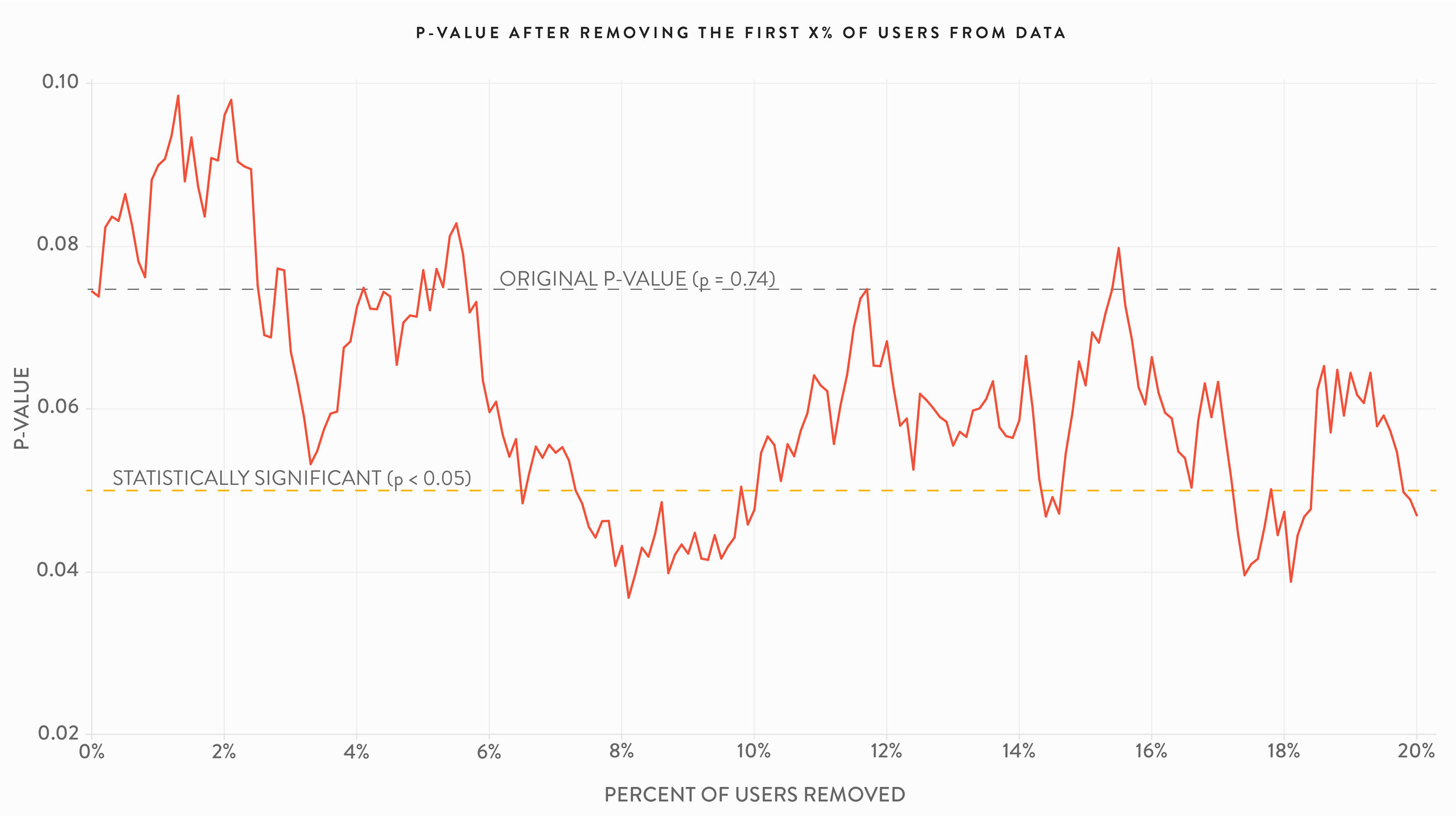

The 7-day retention effects of the gates were also examined. Unlike the 1-day retention case, while the p-values of 7-day retention did vary using the robustness checks they are all statistically significant (the p-value of the entire test population was 0.001). Again, the specifics of the dataset and experimental or analytical setup along with business context dictate the extent to which any of the issues raised in this article are practical concerns.
The impact of missing data on the p-value
In the section above we discussed the effects on p-values of removing a random selection of X% of our data. That allows us to uphold one of the assumptions of the p-value, that chance is acting alone (again “chance” means random error). In many settings, including web analytics, we know a priori that random chance is not acting alone to produce the data. That is, the “random chance” assumption is always violated. For example, internet bots visit websites, customers block third-party cookies, engineering teams don’t implement metatags consistently, web telemetry beacons don’t fire with absolute certainty, internet connection speeds are sometimes slow, A/B testing software times out. All of these concerns (and more) cause the data to become messy.
In A/B testing in particular, it is not uncommon to see a coverage of “only” 85% of website customers. The remaining 15% of customers are excluded from A/B tests due to slow internet connections, blocking of third-party cookies, or other reasons. These “missing” 15% of users are likely unique in some way, given by the fact that they aren’t included in the test in the first place (ex. customers that block third-party cookies are different from those that don’t). Therefore, the fact that these user are excluded from our dataset might cause a systematic, rather than random, bias in the test results, exaggerating the extent to which those users influence the p-value. However, because a customer is missing from an A/B test does not make them any less of a customer. If looking at the 85% of data that is available leads to one decision, but looking at 100% of the data would have led to a different decision this creates suboptimal decision making.
| Variation | Retained users | Total users exposed | Retention rate |
|---|---|---|---|
| Gate at level 30 | 8,502 | 44,700 | 19% |
| Gate at level 40 | 8,279 | 45,489 | 18.2% |
The impact of missing data can be explored by simulating what occurs when missing users are added back into the dataset under various assumptions about their user behavior. Here we explore hypothetical missing data in the Cookie Cats 7-day retention experiment. The initial results of the 7-day retention A/B test are shown at right. A total of 90,189 user were exposed to the test, with Gate 30 producing a slightly higher retention rate than Gate 40 (19% vs. 18.2%). The p-value of this result was 0.0016, highly significant.
Suppose that 15% of the data was missing from this experiment. The total user count would then be 106,104 (106,104 * .85 = 90,189), for a total of about 16,000 missing users. We can take those users and randomly assign them to either Gate 30 or Gate 40 as would have happened had they been included in the actual A/B test. We can then assign those users differing retention rates and see the impact on the p-value of the full dataset that includes both the original users and the missing ones we’re adding back in.
As discussed above we suspect these users are missing for a reason and therefore might not have the same behavior as the users that were exposed to the test. If we fix the retention rate of missing users exposed to Gate 30 at the same 19% rate as the actual experiment, but increase the retention rate of missing users exposed to the gate at level 40, the p-value changes drastically. Suppose instead of being retained at 18.2% for Gate 40 the missing users would’ve been retained at 21% instead. After adding in the missing users this small change would result in the entire experiment failing to meet statistical significance. If we imagined that Gate 40 was even more impactful for the missing users, retaining them at 27%, the results of the entire experiment are reversed and instead of Gate 30 producing a statistically significant increase in retention rate it produces a statistically significant decrease.
Indeed, if the missing users are unusual in their retention rates even a small amount of missing data can change the experimental results. If Gate 40 produced a retention rate of 25% then just 5% of users missing from the experiment is enough to cause the entire experiment to fail to meet statistical significance.
The chart below shows the results of fixing Gate 30 at its true retention rate of 19% and increasing the Gate 40 retention rate to higher levels when various amounts of data are missing. For example, the 29% marker on the x-axis means the Gate 30 retention rate is still 19%, but the Gate 40 retention rate for the missing users was 29%. Below the horizontal line centered at a p-value of 0 Gate 30 has a higher retention rate than Gate 40, the true outcome using the original data. Above the line Gate 40 is better.
The chart may seem tricky to read so some examples will help illustrate. Consider the situation above where 15% of data is missing and Gate 40 has a retention rate of 21% for missing users. In that case we said that the experiment would no longer attain statistical significance after those users are added back in. This is seen in the chart by following the blue line, representing 15% of data missing, to the x-axis marker of 21%. At that point the line exists the yellow area of statistical significance (it actually exists the yellow zone between 20% and 21%). If we follow the blue line up to 27% we see that the blue line enters the yellow region of statistical significance for Gate 40 having a higher retention rate. Again, this is consistent with the example given above. At a Gate 40 retention rate of about 24% the blue line crosses the center line and into the zone of Gate 40 having a higher retention rate than Gate 30, but not at at statistically significant lift.
The chart demonstrates that a moderate amount of missing users with reasonable assumptions about the behavior of those users can change the results of the entire experiment from statistically significant to nonsignificant or from statistically significant in favor of Gate 30 to statistically significant in favor of Gate 40. And remember our original p-value was not on the border of significance, it was 0.0016, more than an order of magnitude smaller than the standard 0.05.
This chart depicts just one set of reasonable possibilities similar to those observed in the actual experiment. However, one might hypothesize that missing users are actually very unlikely to be retained at all, they are evading web tracking for a reason. If the missing users were very unlikely to be retained, say 1% retention for Gate 30 and 3% for Gate 40 then adding those users back into the experiment is still enough to cause the entire experiment to fail to meet statistical significance.
None of this is a surprise. The p-value is designed to be sensitive to changes in the data so adding in a set of missing users with behavior that is different from users that were in the actual experiment is enough to completely alter the p-value.
The extent to which missing data biases analysis or A/B test results and whether the bias alters the p-value to a practically important degree depend on the specifics of the situation and underlying data. However, it is decidedly incorrect to assume that simply because the percentage of missing data is relatively small or because the p-value itself is highly significant that missing data is inconsequential and cannot alter the outcome of an analysis or experiment that was obtained using available data.
Average Order Value
Click-through rate (CTR) is an important metric for many A/B tests. However, it is not the only success metric of interest. In fact, in many tests it is of secondary interest to more top-line measures like average order value (AOV), total revenue divided by total orders. Once again simulations can help investigate the properties of p-values for experiments where AOV is used to determine the winner.
Whereas CTR uses simple proportions (clicks vs non-clicks), an AOV simulation requires a special kind of distribution. We chose to use a Gamma distribution (with shape parameter of 2 and rate parameter of 0.01) scaled so that the y-axis can realistically represent order volumes of a single week at a boutique retailer. This distribution is shown in the chart below.
By changing the parameters that define the distribution it is possible to slightly modify the shape of the Gamma distribution, simulating an A/B test that might increase AOV by, say, $10.
We conducted 100,000 simulations each for A/B tests where the population difference in AOV ranged from $0 to $20, by $1 increments. The results were representative of those in the CTR simulations. We set the sample size so that a lift of $10 achieved 80% power; nonetheless, we observed lower lifts achieve statistical significance with estimated lifts approaching the $10 mark. For instance, two AOV distributions where the actual population difference was just $5 resulted in statistically significant results nearly 30% of the time with an average AOV increase of $9.16.
Again, sign errors were only an issue for very underpowered tests. The sign error rate for AOV was very close to that observed for CTR simulations. For experimental simulations that reached statistical significance the sign error rates were:
50% when the true AOV population difference was $0
21% when the true AOV population difference was $1
7% when the true AOV population difference was $2
2% when the true AOV population difference was $3
Less than 1% for AOV population differences of $4 and up
Summary results of three simulated AOV tests are shown below.
| Actual difference in population AOV | Estimated difference in population AOV* | Percent significant | Percent sign error* |
|---|---|---|---|
| $0 | $0.08 | 5.1% | 49.8% |
| $5 | $9.16 | 29.2% | 0.12% |
| $10 | $11.24 | 80.4% | 0% |
| *For statistically significant trials | |||
Average Order Size
Another common measure of test success is average order size (AOS), the average number of items in a single order. Order sizes can be simulated via a discrete distribution, like the one shown below meant to simulate weekly orders of a boutique retailer that sells a number of low cost accessories in addition to more expensive items. This retailer had 500 orders with a single product, 100 orders that contained two items, another hundred that contained three items, 50 that contained four items, and so on. A small number of orders contained 40 items, simulating customers stocking up on a large number of accessories or wealthy customers with more to spend.
Using AOS as a success metric for A/B tests can be simulated with two different distributions like the one below, with each distribution having a different set of probabilities for each order size.

We conducted 100,000 simulations each for A/B tests where the population difference in AOS ranged over statistical powers from 10% to 100%. The results were representative of those in the CTR and AOV simulations. The two distributions that resulted in a statistical power of 10% (the difference in AOS of the two distributions was statistically significant 10% of the time), resulted in the treatment having an estimated AOS lift of 0.41 over the control, when the actual population difference was just 0.12 (meaning the estimate was almost four times too large!).
Tests with higher statistical powers also had overestimates of the true difference in AOS between treatment and control (similar to the CTR and AOV cases). Differences in actual versus estimated AOS are shown in the table at right.
| Statistical power | Actual difference in population AOS | Estimated difference in population AOS* |
|---|---|---|
| 10% | 0.12 items per order | 0.41 items per order |
| 40% | 0.32 items per order | 0.50 items per order |
| 80% | 0.52 items per order | 0.59 itmes per order |
| 100% | 3.1 items per order | 3.1 itmes per order |
| *For statistically significant trials | ||
It’s important to note that distributions resulting in the specified statistical powers are not unique. Other distributions that reasonably simulate retailer orders could have resulted in similar statistical powers, but different AOS population differences.
Rather than taking a simulation approach focusing on power, it is also possible to set the difference in AOS and examine the resulting power. Summary results of this method are shown below. Again, it is important to note that the distributions we created that result in these AOS differences are not unique.
| Actual difference in population AOS | Average estimated difference in population AOS* | Percent of trials with statistically significant differences | Percent sign error* |
|---|---|---|---|
| 0.10 items per order | 0.38 items per order | 8% | 7.6% |
| 0.25 items per order | 0.48 items per order | 27% | 0.17% |
| 0.50 items per order | 0.57 itmes per order | 78% | 0% |
| 0.75 items per order | 0.76 itmes per order | 99% | 0% |
| *For statistically significant trials | |||
Sign errors were not a significant problem in either approach, the largest sign error rate for the power-centric method was 4.7% (in the simulation of 10% power), while in the AOS difference method the highest sign error rate was 7.6% (in the simulation that had a difference of 0.10 items per order, resulting in 8% power).
Don't worry, researchers get it wrong too
Misunderstandings around p-value replication are not limited to business analysts and falling prey to these misunderstandings doesn’t make one statistically inept. In fact, surveys have shown that many professional academic researchers misunderstand the meaning of the p-value as well, with many believing that 1-p represents the probability of replication. Under this “replication delusion,” as Gerd Gigerenzer terms it, a p-value of 0.05 means that 95% of future experiments using the same experimental design would again result in a statistically significant result (at the 0.05 level). As we have seen throughout this article, that interpretation of the p-value is inaccurate.
In his 2018 paper “Statistical Rituals: The Replication Delusion and How We Got There” Gigerenzer reviewed a number of previous surveys that asked psychologist to assess the truthfulness of statistical statements related to the p-value [36]. The replication delusion was widely believed across various psychological fields. The results of this literature review are reproduced in the table below. For more “statistical delusions” see our upcoming article on common p-value misunderstandings.
| Study | Description of group | Country | N | Statistic tested | Respondents exhibiting the replication delusion |
|---|---|---|---|---|---|
| Oakes (1986) | Academic psychologists | United Kingdom | 70 | p = 0.01 | 60% |
| Haller & Krauss (2002) | Statistics teachers in psychology | Germany | 30 | p = 0.01 | 37% |
| Haller & Krauss (2002) | Professors of psychology | Germany | 39 | p = 0.01 | 49% |
| Badenes-Ribera, Frias-Navarro, Monterde-i-Bort, & Pascual-Soler (2015) | Academic psychologists: personality, evaluation, psychological treatments | Spain | 98 | p = 0.001 | 35% |
| Badenes-Ribera et al. (2015) | Academic psychologists: methodology | Spain | 47 | p = 0.001 | 16% |
| Badenes-Ribera et al. (2015) | Academic psychologists: basic psychology | Spain | 56 | p = 0.001 | 36% |
| Badenes-Ribera et al. (2015) | Academic psychologists: social psychology | Spain | 74 | p = 0.001 | 39% |
| Badenes-Ribera et al. (2015) | Academic psychologists: psychobiology | Spain | 29 | p = 0.001 | 28% |
| Badenes-Ribera et al. (2015) | Academic psychologists: developmental and educational psychology | Spain | 94 | p = 0.001 | 46% |
| Badenes-Ribera, Frias-Navarro, Iotti, Bonilla-Campos, & Longobardi (2016) | Academic psychologists: methodology | Italy, Chile | 18 | p = 0.001 | 6% |
| Badenes-Ribera et al. (2016) | Academic psychologists: other areas | Italy, Chile | 146 | p = 0.001 | 13% |
| Hoekstra, Morey, Rouder, & Wagenmakers (2014) | Researchers in psychology (Ph.D. students and faculty) | Netherlands | 118 | 95% CI | 58% |
What to do about p-value replicability
The question of what to do about p-value replicability is simple: accept it. P-values are constructed in such a way that they are not meant to replicate. As researchers Valentin Amrhein, David Trafimow, and Sander Greenland phrased it in the title of their March 2019 article in The American Statistician, “There Is No Replication Crisis if We Don’t Expect Replication” [37]. But that is little comfort to the analyst or marketer that must carry out A/B testing as part of their company’s experimentation program and use the results to make real-world decisions about website design and layout.
The Research is working on a comprehensive set of suggestions found throughout the statistical literature. However, a simple approach with important implications is to move away from a focus on significance and toward a focus on parameter estimation. In this context parameter estimation means estimating the difference in group averages, for example the CTR lift between the treatment and control.
A fit-for-purpose estimation tool available today is the familiar confidence interval, a concept that some statisticians encourage renaming to “compatibility intervals” [38]. The suggested renaming is due to the fact that confidence intervals produce a range of effect sizes that are compatible with the data that produced them. Although the point estimate, the center of the confidence interval, is the effect size most compatible with the data, all values within the interval represent effects that are reasonably compatible. Effects outside the confidence interval are not implausible, but simply less compatible with the data than values within the interval.
Confidence intervals are by no means the only way to address the variability inherent in p-values. Some statisticians would recommend using Bayesian techniques, for example. However, we feel that confidence intervals have some advantages over other statistical methods. Confidence intervals are familiar to many business analysts and marketers, are defined under the frequentist paradigm (like NHST), they are produced automatically by most A/B testing tools, they are a standard component of all statistical software packages, and they don’t require specialized statistical skills or knowledge to produce and understand.
Confidence intervals provide much more useful and reliable information than p-values. Unlike the p-value, confidence intervals contain magnitude information. And while this article has shown that p-values have poor replication properties, confidence intervals do much better. As the name implies, 95% confidence intervals contain the true population parameter of interest 95% of the time. That means if we were to repeat our CTR A/B test 100 times, roughly 95 of the confidence intervals produced by those experiments would contain the true lift for our entire customer base (whatever that lift happened to be).
It is important here again to distinguish between long-term statistical properties and those of a single experiment. Before an experiment is conducted the 95% confidence interval has a 0.95 probability of containing the true population parameter. After an experiment is conducted the confidence interval either does or doesn’t contain the true population parameter, although we never know which of the two cases is correct. Therefore, confidence intervals are not post-experiment probability statements about the likelihood a population parameter is contained within them (unlike, for example, Bayesian credibility intervals).
It is important to remember that because confidence intervals are produced within the NHST framework they have the same underlying assumptions. For example, non-random error in data could produce confidence intervals that have a pre-experiment probability of less than 0.95 of containing the true population parameter. And confidence intervals do not provide any information about the plausibility of values within them. A confidence interval produces both an upper and a lower bound around the point estimate, but this does not necessarily mean that the true population parameter is uniformly likely to fall anywhere within the range.
Despite these limitations confidence intervals are a substantially better tool for decision making than p-value thresholds. One advantage of confidence intervals is that they can help protect against downside risk since they contain all estimates compatible with the data, a feature p-values paired with point estimates lack.
The graph below shows the average 95% confidence interval for each population lift in our CTR experiment (produced from the 2.1 million CTR simulations outlined earlier in this article). Suppose we ran an experiment and the lift of our treatment was 10% as we expected. Looking at the graph we can see in that scenario the lower confidence interval bound is around 3% lift while the upper bound is around 17%. This implies that if we move forward with implementing the treatment we should be prepared to see only a 3% lift. Of course, even a lift of 3% produces some benefit, so the treatment may still be worth implementing. On the other hand, implementation is not costless. If, for example, the cost-benefit ratio was negative for any treatment with a CTR of less than, say, 9% then the business would need to have a discussion about whether it was worth moving forward.
Confidence intervals of simulated A/B tests
Importantly, this logic extends to confidence intervals which cover 0. The result of an A/B test whose confidence interval includes 0 would not achieve statistically significance and therefore would fail to be implemented under the standard decision rule (by definition treatments which are statistically nonsignificant have confidence intervals whose lower bound cover 0). However, looking at things with an eye toward compatibility changes the story. Often times such statistically nonsignificant treatments have confidence intervals that include some positive benefit.
Suppose the point estimate of a recently completed A/B test is just 6%. The lower bound of the confidence interval suggests implementing the treatment would reduce CTR by around 1%. However, the upper bound of the confidence interval suggests the lift improvement could be as large as 13%. If the implementation cost isn’t too high and you can stand the risk, then the treatment might be worth moving forward with due to its potential upside. One strategy might be to undertake a partial rollout and monitor the results, abandoning further implementation if the downside risk is realized as the solution scales.
In our estimation, the fact that confidence intervals must be coupled with human judgement is a feature not a bug. For a poignant argument of this point of view we turn to the psychologist Charles Lambdin [39]:
The making of scientific inferences is always a qualitative process. It is something that we must do ourselves. It can be helped by mathematics, but it cannot be replaced by mathematics. Math does not do the reasoning for us. The hard work will always take place between our ears. If we feel that our results, without being dressed up with excessive quantification, are not fancy enough, then we should remind ourselves that almost all great discoveries in science were qualitative in nature. Furthermore, many of the genuine great discoveries in psychology were made by researchers who were not using significance tests.
Businesses may worry that the lack of the bright-line decision rule provided by statistical significance will slow down implementation and overcomplicate testing, resulting in arguments about what the range of a confidence interval implies in terms of concrete action. But business processes can be put in place to streamline decision making based on confidence interval ranges. For example, tests might be bucketed into a 3x3 matrix with high, medium, and low cost implementations as the columns and high, medium, and low risk as the rows. A high cost/high risk test might require a narrow confidence interval with a relatively high lower bound. A low cost/low risk solution might be implemented even if the confidence interval includes zero as long as the upper bound meets some pre-defined threshold. Tests that result in confidence intervals that don’t meet the requisite conditions associated with their costs and risks would not be implemented or would be retested to confirm the results. (If time and cost constraints are not prohibitive retesting is always a good idea, even if the treatment showed substantial lift).
One can envision other frameworks for incorporating confidence intervals into A/B testing programs, but whatever business process is put in place should incorporate both the cost and risks of a test while simultaneously uncovering possible benefits of implementation and provide simple heuristics that allow analysts autonomy in determining implementation decisions without drawn out debates about the meaning of test results.
Focusing on estimation instead of significance also leads to a different strategy with regard to sample size. An experiment of any sample size provides a confidence interval so there is no need to calculate a sample size threshold and keep tests live until statistical significance is achieved. A/B testing on smaller websites is often ignored due to concern that achieving sample size for statistical significance will take an unreasonable amount of time. But understanding that statistical significance provides little if any useful information frees us from this constraint. Any website small or large can run an A/B test for as long as is reasonable and then examine the resulting confidence interval.
It is true that A/B tests on smaller sites may have wider confidence intervals due to smaller sample size, so there is still a strategic element of deciding when and which tests to run and where to run them. But a focus on estimation rather than significance changes the calculus of that strategy away from simple declarations about low customer traffic.
In estimation the focus on sample size shifts from calculations aimed at achieving statistical significance to calculations aimed at determining an estimate’s precision, the desired width of a confidence interval. Different experiments require different confidence interval precision based on the success metrics at play and other specifics of the experiment.
Confidence intervals also fit into the standard multiple comparison framework. Whereas normally the number of comparisons is translated into a more stringent p-value threshold, in estimation the number of comparisons are translated into wider confidence intervals. Again, larger sample sizes can shorten confidence interval widths, even when multiple comparisons are at play.
Focusing on a p-value threshold via statistical significance offers a simple rule for implementation, but does little else. By design p-values have large natural variability and therefore poor replication from experiment to experiment. P-values are easy to misinterpret, offer weaker evidence than most believe, and they give no information about the range of effect sizes, the most important piece of information from a practical point of view. As a result p-values cannot help protect against downside risk or capture potential upside benefits. For all of these reasons statistical significance is a suboptimal decision making rule.
Confidence intervals do better.
Code samples
Code examples and technical documentation can be found here.
References & theoretical basis
References:
John W. Tukey, “The Philosophy of Multiple Comparisons”, Statistical Science, 1991 [link]
Calyampudi Radhakrishna Rao and Miodrag Lovric, “Testing Point Null Hypothesis of a Normal Mean and the Truth: 21st Century Perspective”, Journal of Modern Applied Statistical Methods, 2016 [link]
Jae Kim and Andrew Robinson, “Interval-Based Hypothesis Testing and Its Applications to Economics and Finance”, Econometrics, 2019 [link]
Andrew Gelman and Eric Loken, “The garden of forking paths: Why multiple comparisons can be a problem, even when there is no “fishing expedition” or “p-hacking” and the research hypothesis was posited ahead of time”, working paper, 2013 [link]
James Berger and Donald Bevy, “Statistical Analysis and the Illusion of objectivity”, American Scientist, 1988 [link]
Raymond Hubbard and Murray Lindsay, “Why P Values Are Not a Useful Measure of Evidence in Statistical Significance Testing”, Theory & Psychology, 2008 [link]
Scott Armstrong, “Statistical Significance Tests are Unnecessary Even When Properly Done and Properly Interpreted: Reply to Commentaries”, International Journal of Forecasting, 2007 [link]
Greenland et. al., “Statistical tests, P values, confidence intervals, and power: a guide to misinterpretations”, European Journal of Epidemiology, 2016 [link]
Greenland et. al., “Statistical tests, P values, confidence intervals, and power: a guide to misinterpretations”, European Journal of Epidemiology, 2016 [link]
Geoff Cumming, “Replication and p Intervals: p Values Predict the Future Only Vaguely, but Confidence Intervals Do Much Better”, Perspectives on Psychological Science, 2008 [link]
Greenland et. al., “Statistical tests, P values, confidence intervals, and power: a guide to misinterpretations”, European Journal of Epidemiology, 2016 [link]
Steven Goodman, “A Comment on Replication, P-Values, and Evidence”, Statistics in Medicine, 1992 [link]
Shravan Vasishth, Daniela Mertzen, Lena A. Jäger, & Andrew Gelman, “The statistical significance filter leads to overoptimistic expectations of replicability”, Journal of Memory and Language, 2018 [link]
Katherine S. Button, John P. A. Ioannidis, Claire Mokrysz, Brian A. Nosek, Jonathan Flint, Emma S. J. Robinson, & Marcus R. Munafò, “Power failure: why small sample size undermines the reliability of neuroscience”, Nature Neuroscience, 2013 [link]
John Ioannidis, “Why most discovered true associations are inflated”, Epidemiology, 2008 [link]
Journal of Simulation, 2006-2019 [link] (just one of many academic journals focusing on simulation)
Byron Morgan, Elements of Simulation, 2018 [link]
Yahya Esmail Osais, Computer Simulation: A Foundational Approach Using Python, 2017 [link]
P.W.A. Lewis & Ed McKenzie, Simulation Methodology for Statisticians, Operations Analysts, and Engineers, 1988 [link]
Andrew Greasley, Simulation Modeling for Business, 2017 [link]
Keke Gai, Meikang Qiu, Hui Zhao, & Wenyun Dai, Anti-Counterfeit Scheme Using Monte Carlo Simulation for E-commerce in Cloud Systems”, IEEE, 2015 [link]
Brad Efron, “Bootstrap Methods: Another Look at the Jackknife”, The Annals of Statistics, 1977 [link]
“Law of Large Numbers”, Wikipedia, [link]
Thomas Burch, “Simulation and Statistical Modeling: Rivals or Complements?”, Model-Based Demography, 2017 [link]
Atkinson et. al., “Harnessing advances in computer simulation to inform policy and planning to reduce alcohol-related harms”, International Journal of Public Health, 2018 [link]
Alfio Quarteroni, “The role of statistics in the era of big data: A computational scientist’ perspective”, Statistics & Probability Letters, 2018 [link]
Shravan Vasishth, Daniela Mertzen, Lena A. Jäger, & Andrew Gelman, “The statistical significance filter leads to overoptimistic expectations of replicability”, Journal of Memory and Language, 2018 [link]
John Carlin & Andrew Gelman, “Beyond Power Calculations: Assessing Type S (Sign) and Type M (Magnitude) Errors”, Perspectives on Psychological Science, 2014 [link]
Andrew Gelman, “It’s not just p=0.048 vs. p=0.052”, Statistical Modeling, Causal Inference, and Social Science (blog), 2019 [link]
Andrew Gelman and Hal Stern, “The Difference Between “Significant” and “Not Significant” is not Itself Statistically Significant”, The American Statistician, 2006 [link]
Valentin Amrhein, David Trafimow, & Sander Greenland, “Inferential Statistics as Descriptive Statistics: There Is No Replication Crisis if We Don’t Expect Replication”, The American Statistician, 2019 [link]
Valentin Amrhein, Sander Greenland, & Blake McShane, “Scientists rise up against statistical significance”, Nature, 2019 [link],
Greenland et. al., “Statistical tests, P values, confidence intervals, and power: a guide to misinterpretations”, European Journal of Epidemiology, 2016 [link]
Charles Lambdin, “Significance tests as sorcery: Science is empirical—significance tests are not”, Theory & Psychology, 2012 [link]
Mingfeng Lin, Henry C. Lucas, Jr., & Galit Shmueli, “Too Big to Fail: Large Samples and the P-value Problem”, Information Systems Research, 2013 [link]
Gerd Gigerenzer, “Statistical Rituals: The Replication Delusion and How We Got There”, Advances in Methods and Practices in Psychological Science, 2018 [link]
Valentin Amrhein, David Trafimow, & Sander Greenland, “Inferential Statistics as Descriptive Statistics: There Is No Replication Crisis if We Don’t Expect Replication”, The American Statistician, 2019 [link]
Valentin Amrhein, David Trafimow, & Sander Greenland, “Inferential Statistics as Descriptive Statistics: There Is No Replication Crisis if We Don’t Expect Replication”, The American Statistician, 2019 [link]
Charles Lambdin, “Significance tests as sorcery: Science is empirical—significance tests are not”, Theory & Psychology, 2012 [link]
Mark Rubin, “That’s not a two-sided test! It’s two one-sided tests!”, Significance, 2020 [link]
Theoretical basis:
Geoff Cumming, “Replication and p Intervals: p Values Predict the Future Only Vaguely, but Confidence Intervals Do Much Better”, Perspectives on Psychological Science, 2008 [link]
Lewis G Halsey, Douglas Curran-Everett, Sarah L Vowler & Gordon B Drummond, “The fickle P value generates irreproducible results”, Nature, 2015 [link]
John Ioannidis, “Why Most Published Research Findings Are False”, PLoS Med, 2005 [link]
Shravan Vasishth, Daniela Mertzen, Lena A. Jäger, & Andrew Gelman, “The statistical significance filter leads to overoptimistic expectations of replicability”, Journal of Memory and Language, 2018 [link]
Valentin Amrhein, David Trafimow, & Sander Greenland, “Inferential Statistics as Descriptive Statistics: There Is No Replication Crisis if We Don’t Expect Replication”, The American Statistician, 2019 [link]